You had saved your “hard-earned” pocket money for weeks. You oozed over the racks before deciding where your limited budget would be spent. You were attracted to the double gatefold, especially if the lyrics were included on the inside. You were looking for extras that were included such as a poster or stickers. You went home and poured over your latest art purchase, handling it with care as if you had been to Christies instead of Chalmers and Joy
If the light show was integral to the concert experience then the cover was integral to the album experience. By albums I am of course talking in old money. This is imperial rather than metric, twelve inches rather than 12 cm, analogue rather than digital, magnetic rather than optical, vinyl rather than polycarbonate.
At that time my friends and I all had decent quality hi-fi turntables and systems. We got excited at the quality of recording when listening to Dark Side of the Moon and other albums associated with superior sound. But this is not about how albums sounded, this is about how they looked. As well as the sound, Dark Side of the Moon also had "the look."

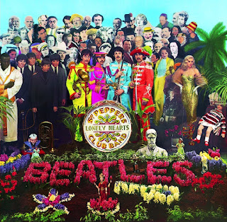
OK to start with there is the blank canvas of 12 x 12 inches. Small enough to be stored neatly at home but large enough to enable complexity and detail and with an album that had a double gatefold the artist’s work could extend to the reverse of the cover and/or on the inside cover also. There is a definite development on album design evident from say the early 1960s into the late 1960 and early 1970s. If we take for example albums by The Beatles we can see that 1963’s Please Please Me and also With The Beatles from the same year use basic photographic images of the band. It is not until 1966 and Revolver that we see the use of illustration by Klaus Voorman. The standard must surely have been set with 1967’s Sergeant Pepper featuring a day-glo collage of famous people surrounding the band.

By the 1970s the attention given to album design was part and parcel of the popular music product and it gave some artists and designers the opportunity to make their mark. Best known for a succession of covers for the band Yes, Roger Dean’s distinctive fantasy landscapes and design of the band’s logo was very much part of the Yes experience. Storm Thorgerson cut his teeth with Pink Floyd and has gone on to sustain his involvement in cover design to the present day with bands like Dream Theater, Muse and Biffy Clyro.

Compact discs became commercially available in 1982. Fast forward thirty years and we have had two generations that have grown up without exposure to the album cover culture. It appears as if this was the beginning of the end for the album cover. Indeed, my friend’s wife, who is an art teacher, did a school project on designing album covers. Her class of teenagers just didn’t “get it.” With the increasing popularity of digital music downloading the role that packaging (and thus the "album cover") will play in consumer music sales in the near future is uncertain.
However it is good to know that there are sites devoted to the album cover aficionado and here are a couple of links:
0 comments:
Post a Comment